Questetra BPM Suite でワークフローアプリを作成すると、ヒューマン工程ごとに入力フォーム(業務処理画面)が自動生成されます。入力フォームは、データ項目の設定と各作業工程ごとの表示編集設定に応じて形成されます。
この記事では、生成される入力フォームをより使いやすくするためのデータ項目の設定方法について解説します。
データ型による表示
データ項目はそのデータ型によって、それぞれの入力欄(入力フォーム)が表示されます。

個々の入力インタフェースは、通常、レイアウト幅に合わせて表示されます。数値型、日付/日時型、ファイル型については、固定幅で表示されます。
配置
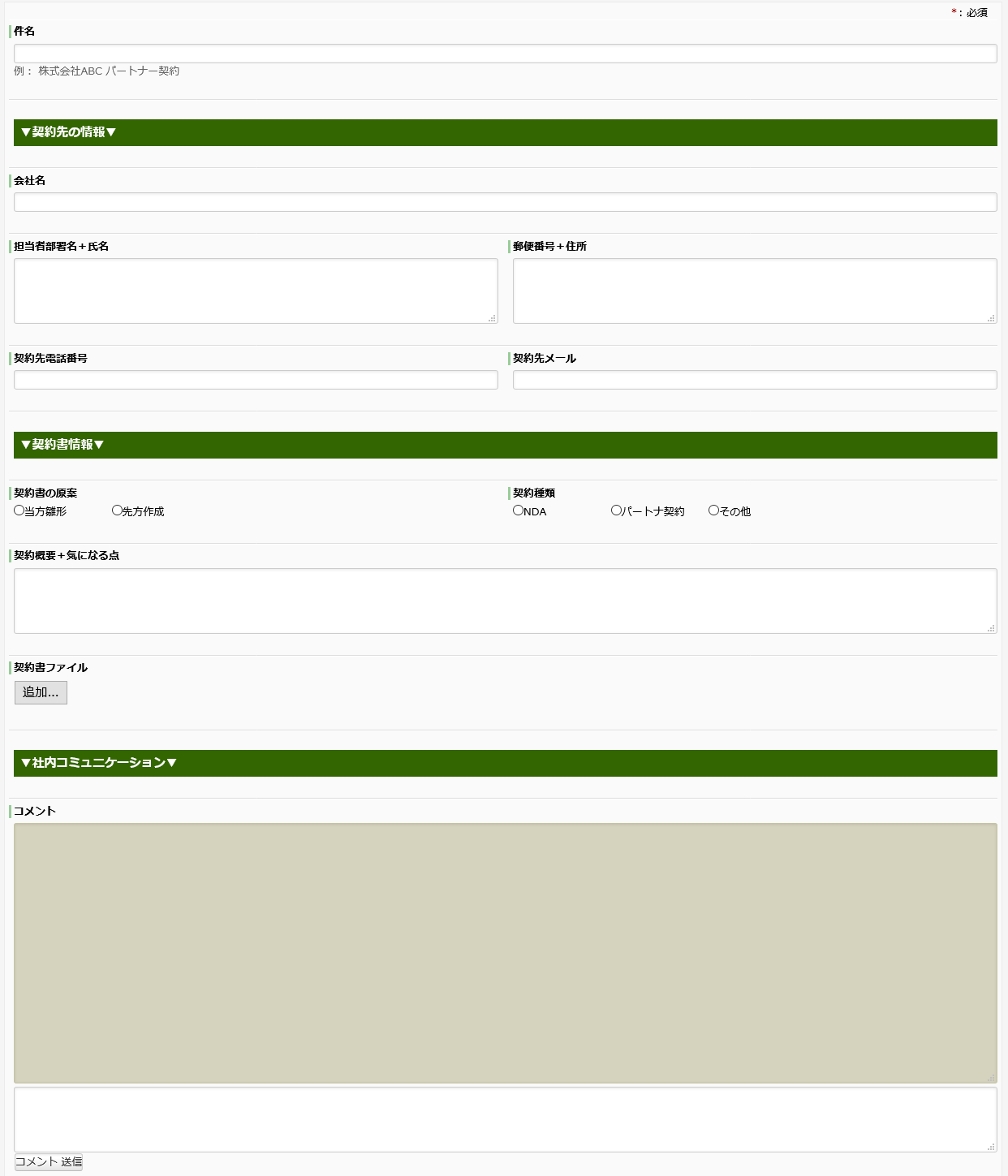
入力フォームを使いやすくするために、まずフォームに表示される入力欄(データ項目)の配置を考えましょう。作業の担当者(処理担当者)にとって作業しやすい配置にします。例えば顧客情報を扱う場合、会社名、所属部署名、氏名、電話番号、メールアドレス、会社住所などの情報をそれぞれ個別のデータ項目に入力する作業が担当者によって処理されます。入力工程の後にこれらの情報を元にした作業、例えば郵便発送やメール配信などの工程の処理担当者など、全ての工程の処理担当者の作業内容を考慮してデータ項目を配置しておけば作業効率の向上につながるはずです。
表示順
フォーム上でのデータ項目の並び順は、アプリ編集画面のデータ項目編集タブでのデータ項目一覧画面での配置がそのまま反映されます。項目を移動して配置を変えたい場合、一覧画面で移動したい項目をドラッグ&ドロップで目的の場所に移動します。
データ項目の整理をしたり新規追加(最下部に追加される)するときなどに有効です。

段組設定
データ項目を追加した当初は段組設定が「1」になっています。これは1つのデータ項目が1行全てを占めることになります。設定を変更することなく多数のデータ項目を羅列すると、フォーム画面が縦に長くなり上下のスクロールが煩わしく感じるかもしれません。

段組設定では1以外に2と4が選択できます。2は1行を二分割、4は四分割した幅になります。分割サイズが設定された項目が連続すると、可能な限り詰められていきます。この機能を利用して、関連する項目を1行に配置することができます。例えば「出張先(文字型)」「出張開始日(日付型)」「出張終了日(日付型)」の3つのデータ項目を配置する場合、段組を「4」に設定すると下図のように1行に収まります。

四分割のスペースにデータ項目が3つなので、右端に空白ができてしまいました。そこで「出張先(文字型)」の段落を「2」にすると1行にぴたりと収まるようにます。

このように、段組設定を使って関連するデータ項目をまとめると、見やすく入力しやすい、コンパクトなフォーム画面ができます。
- テーブル型には段組設定がありません。全幅表示になります。
- 複数のデータ項目に段組設定する場合は一括設定が便利です。Sift+クリックで選択してから、アイコンをクリックして段組数を選択してください。
データ型固有の設定
データ型によっては、段組以外に個別の設定を持つものがあります。
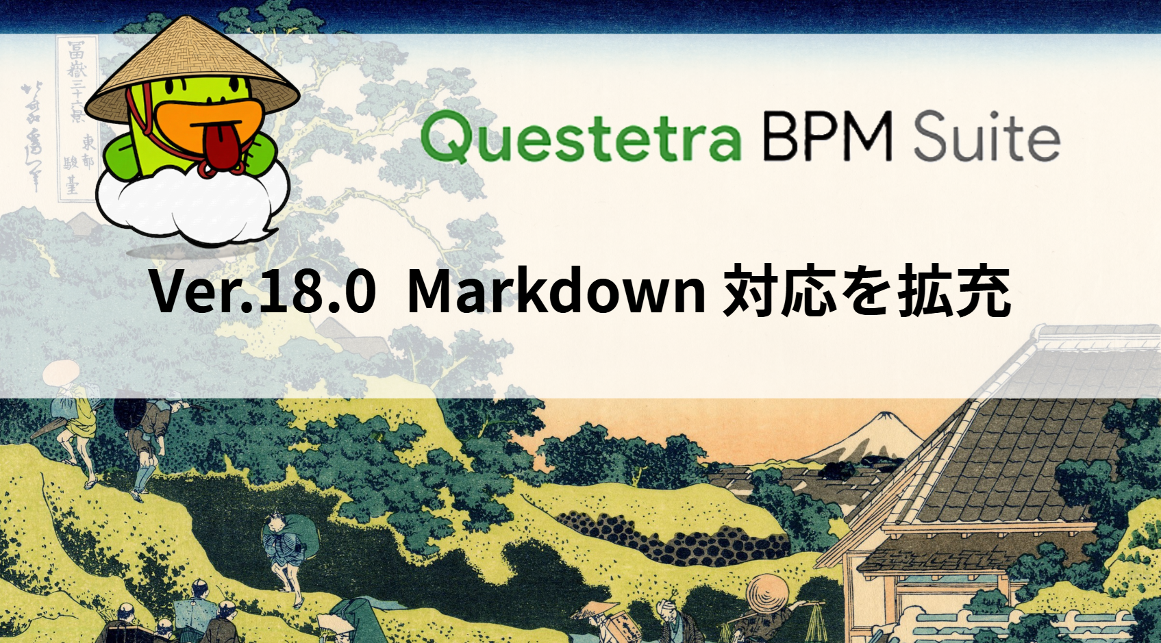
文字型(複数行)
入力フォームが表示されたときの行数(入力欄の高さ)を設定できます。プロパティ画面の[行数]の設定欄に数字で指定します。(デフォルトは空で表示されるのは15行)
入力が想定される文章に応じて設定するのが良いでしょう
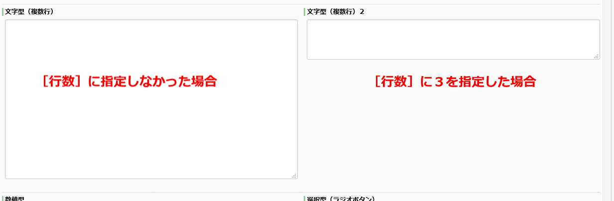
選択型(ラジオボタン/チェックボックス)
設定された段組表示の中での1列の選択肢の表示数を指定します(1~10)。段組と同じように、表示区域を指定された数で分割します。選択肢の数が分割数より少なければ、選択肢表示が左に寄り右側は空白となります。逆に選択肢の数が分割数を上回れば、複数列表示となり次の列に送られます。(設定を1にすると縦並びの表示になります。)
選択肢の表示ラベルの文字数が少ない場合などに、ボタン/チェックボックスどうしの距離が近い方が入力しやすくなります。
データ項目個別の表示
説明
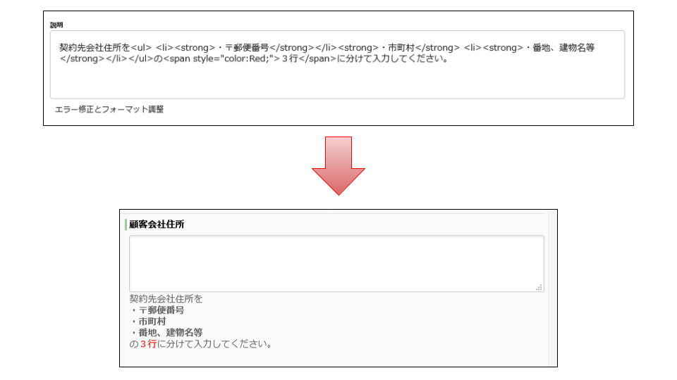
全てのデータ型のプロパティには[説明]という設定欄があります。[説明]に入力された文字は、入力フォーム上の当該データ項目の入力欄の下に表示されます。処理担当者が入力作業を行う際への例文やヒント、あるいは注意事項などを表示させることで、処理担当者にとって作業しやすい入力フォームになります。
さらに、[説明]では HTML タグが使用できます*。改行(<br>)をはじめ文字色(<span style>)を変えたり箇条書き(<ul><li>)といった装飾を加えることで、より一層使いやすい入力フォームになります。
(*使用できる HTML タグ)
R2131:Markdown で利用できる HTML 要素
プレースホルダ
文字型には[プレースホルダテキスト]という設定項目があります。プレースホルダとは入力前の入力欄内に文字を表示させる機能です。入力を始めると表示されなくなります。[プレースホルダテキスト]に入力例を設定しておくと、例えば電話番号を入力する際にハイフンを使用するといったフォーマットの指定を、処理担当者が直感的に感知できるようになります。

ガイドパネル
Questetra BPM Suite では[ガイドパネル]という、入力フォーム上での表示だけに特化した項目を定義できます。[ガイドパネル]にはデータを入力したり保存したりはできません。[説明]と[段組]の設定だけが可能です。
この[ガイドパネル]をうまく活用することで、膨大な数のデータ項目で構成された入力フォームでも、目的のデータ群を素早く見つけられるようになります。
Questetra がお勧めする使い方は以下のようなものです。
まずデータ項目を内容や作業手順などに応じて分類します。その分け目となる所に[ガイドパネル]を配置します。[ガイドパネル]の[説明]に以下の HTML コードを設定します。
<h4 style="font-size:26px;background-color:#198000;color:#ffffff;padding:11px;margin-bottom:3px;">見出し文言</h4>説明文を記入します
入力フォームでは下図のように表示されます。

このように[ガイドパネル]を利用すれば、入力フォームをセクションに区切ってさらに見やすくできます。
なお、上記のような HTML コードをお好みのままに自動出力できる[ガイドパネルデコレータ]を用意しています。
ぜひご活用ください。
また、Professional エディションをご利用であれば、さらに高度な設定として「説明」に JavaScript を記述して動作させることもできます。動的情報やUIを追加するといった事も可能です。
例えば入力中のデータを参照して表示内容を変更したり、入力を補助するボタンなどが実現可能です。
- JavaScript を用いた表示変更やデータ通信は自己責任で設定してください
- Questetra Form JavaScript API も活用可能です
M213: 処理フォーム画面をデコレーションする(HTML/JavaScript)
フォーム画面で「Questetra Form JavaScript API」を利用する
非表示設定
フォーム全体の設定ができれば、最後に各作業工程(タスク)ごとの表示編集権限を設定します。個々の作業において必要のない情報を非表示にしておけばフォーム全体がコンパクトになり、処理担当者にとって不要な情報をスクロールしてスキップする手間を省けます。
M205: 業務に必要なデータ項目(データセット)を定義する
このように、ワークフローアプリの設計者が入力フォームをより使いやすいものにすることで、処理担当者の作業効率を向上させることができます。アプリ完成後も、処理担当者の意見を聞くなどしてより使いやすい入力フォームとなるように改良を重ね、全社での生産性の向上を目指しましょう。